
The problemWhere it started
FEIT was selling premium sneakers through a generic marketplace template. The brand looked like every other reseller, the homepage had no visual identity, and the product pages were spec sheets that read like a wholesaler's PDF. The brand needed a storefront that felt like a sneaker zine, not a Shopify theme.
ApproachWhat we did
- 1
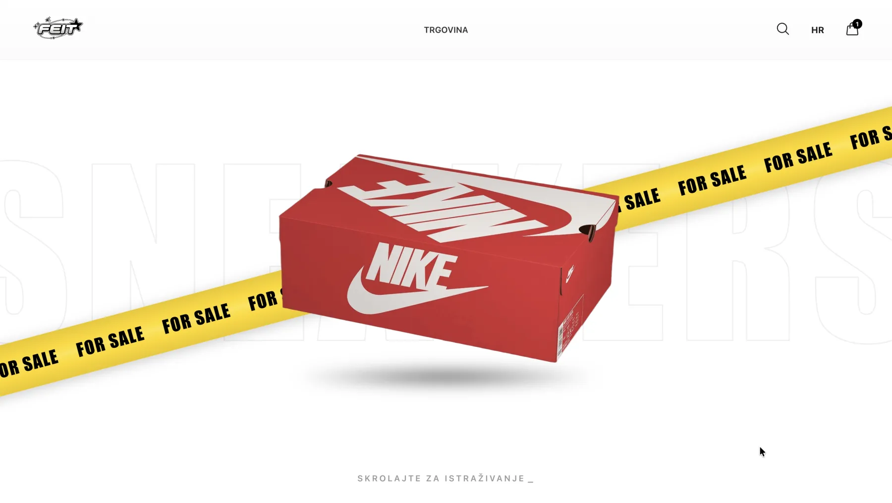
Built a 3D-shoe hero on the homepage so the first impression is the product, not a stock banner.
- 2
Designed product pages around the pair: full-bleed gallery, size selector, no spec-sheet clutter.
- 3
Kept the catalog filterable by brand and price for sneakerheads who already know what they want.
- 4
Mobile-first build, then scaled up to desktop.
The resultThe numbers after launch
From the buildWhat it looks like
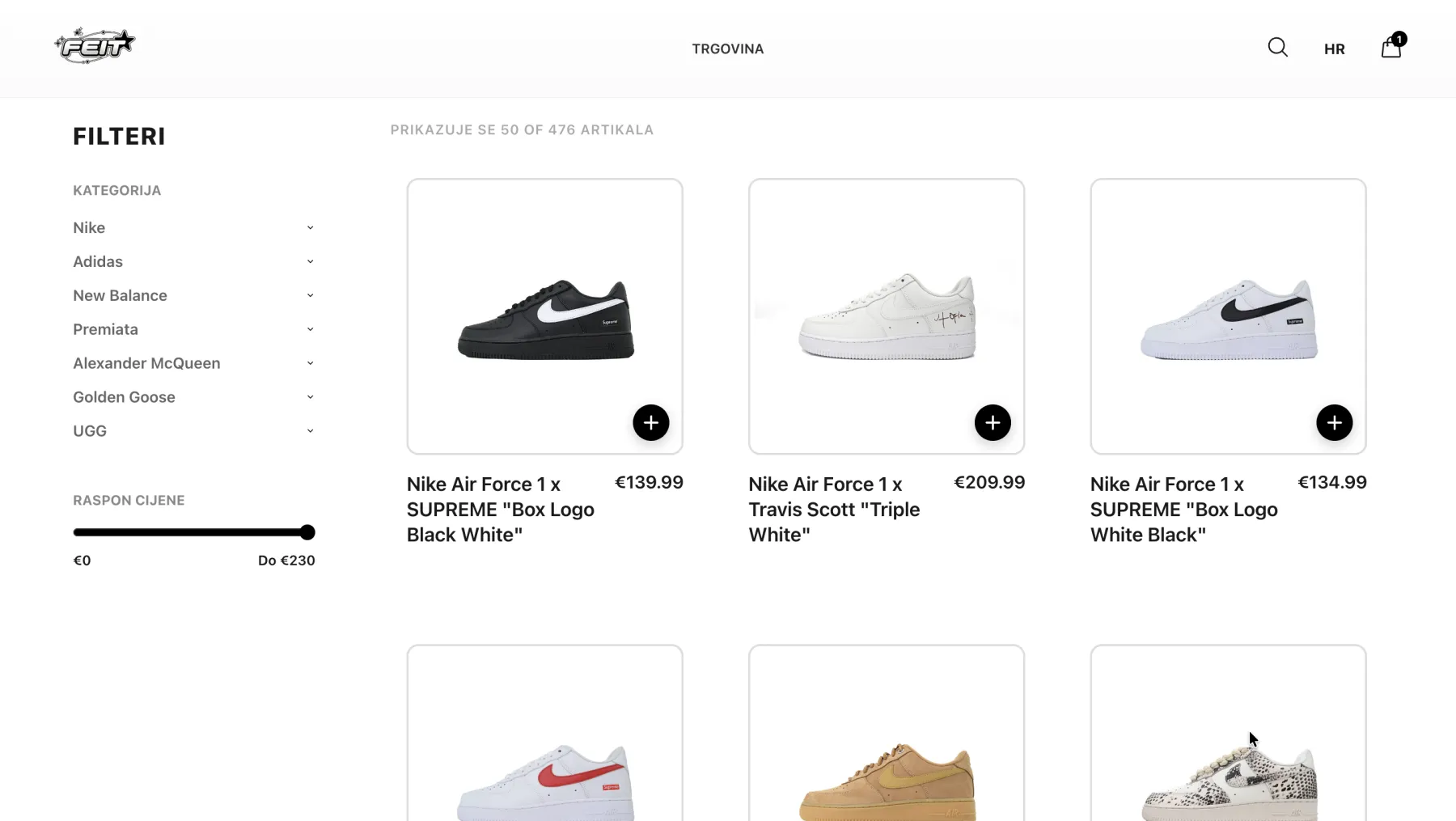
Filterable catalog
Brand and price filters for sneakerheads who already know what they want. No nested categories to dig through.
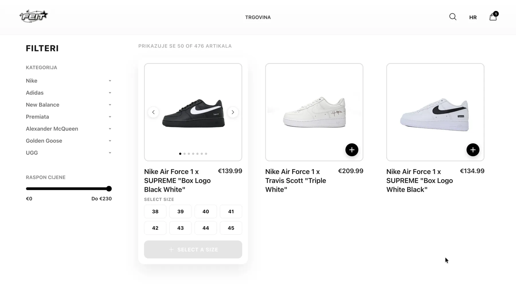
Inline size select
Tap a card and the size grid expands in place. No detail page, no extra route, no friction between browse and add-to-cart.
We launched, watched the first drop sell out in a weekend, and stopped paying for ads the next month.